The Positive Impact of Responsive Web Design On SEO
If people accessing your website on a mobile device still need to do a lot of pinching, zooming, and scrolling sideways just to consume your content, then mobile-friendliness isn’t exactly your site’s strongest suit.
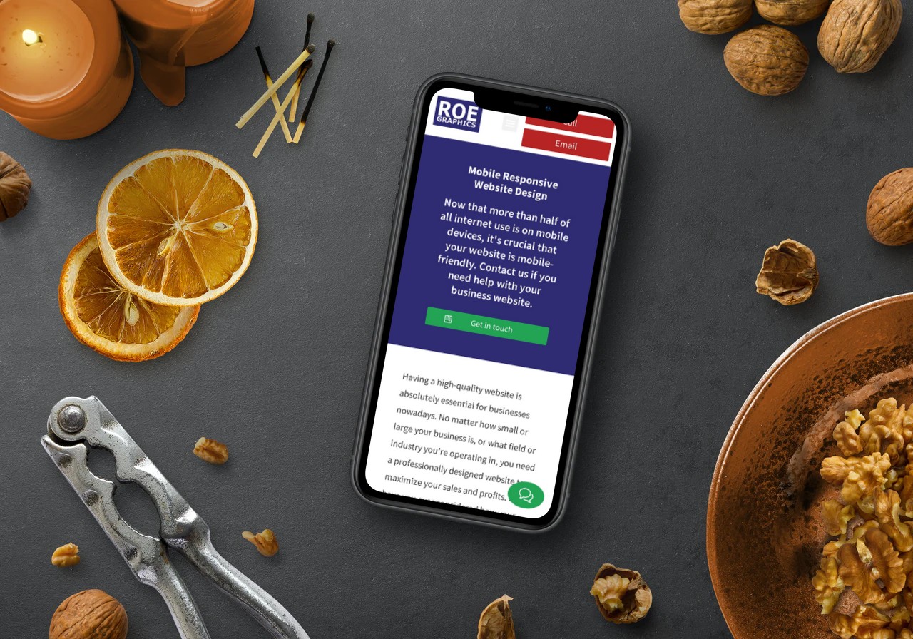
Considering that mobile-friendliness is one of several web design essentials these days, it’s baffling why many webmasters still eschew responsive web design or RWD, which is, so far, the top route towards becoming mobile-friendly.
They could offer several excuses to put off switching to a responsive web design, but surely, its impact on SEO could never be one of them. After all, RWD does bring about a number of SEO benefits.
If you’re the webmaster of a site that isn’t mobile-friendly and you care about your optimization efforts, here are some ways your SEO can benefit from responsive web design.
Faster Page Loading Time
Google has long made it clear that page loading speed is a ranking factor.
With responsive web design, your pages will take less time to load, particularly on smartphones and tablets.
The faster your site’s pages load, the better its chances of landing at or near the top of search engine results pages or SERPs. Now that is one clear SEO benefit courtesy of RWD.
No More Duplicate Content Issues
Duplicate content is bad for your SEO, and it’s something that webmasters would do well to steer clear of at all times.
Some webmasters choose to create a separate mobile website with a different URL in an attempt to be more mobile-friendly.
The problem is, both the mobile and desktop versions carry the same content, something Google will likely interpret as duplicate content, which will eventually send your rankings spiraling.
RWD, on the other hand, simply uses a single site, one URL, and a single content source to make a website render well on any screen size. In effect, responsive web design helps your site sidestep duplicate content issues for good.
Better UX
The phrase “user experience,” or UX for short, has been around for some time.
However, Google’s announcement that user experience will already be considered when ranking web pages beginning 2021 has given the phrase new meaning.
UX will become a ranking factor next year, and responsive web design can help a great deal in enriching the experience of users dropping by your pages.
RWD, for example, can help make navigation a breeze, especially on mobile devices. Responsive web design also makes the content easier to read on any screen size. Both contribute to a great user experience and will undoubtedly impact your rankings starting next year.
Improved Bounce Rates
A high bounce rate means a significant percentage of users leave your website almost as soon as they get there, and that is something that Google notices.
If people do that when accessing your site, Google will take it as a sign that your page is not relevant to the user’s query, and your rankings will likely take a hit.
While content quality is a primary reason users bounce off to another site, web design also has something to do with bounce rates. Navigation issues, readability problems, and a messy layout are web design issues that turn people off and make them leave right away.
With the improved navigation, highly readable content, visually appealing design, and clean and organized pages that come with RWD, people will be more likely to stay and continue exploring your site’s pages, and that should lead to lower bounce rates.
Give responsive web design a try now, if you haven’t already. RWD positively impacts your SEO in more ways than one, and it’s about time you enjoy the benefits that come with it.
About the Author
Gabby Klesser is the Outreach Manager for LA Website Design, a digital marketing agency that has assembled a team of expert web designers and digital marketing strategists. She often writes about web design, UX, social media, technology, marketing, and starting a non-profit.